2019 Design Trends
At the beginning of a new year, we like to check in with the design world to see what was trendy the previous year, and predict what we feel will be popular in the year to come. While this list is by no means something we encourage designers and creatives to stick to, it’s a general forecast of what we’ll probably be seeing a lot of in the coming year, and what clients and consumers may be craving in their branding and marketing material as a result of larger trends. Design trends are influenced by many forces, but we think technology, social movements and politics are huge drivers. See if you can connect any themes in our list of the top 5 design trends of 2019 below.
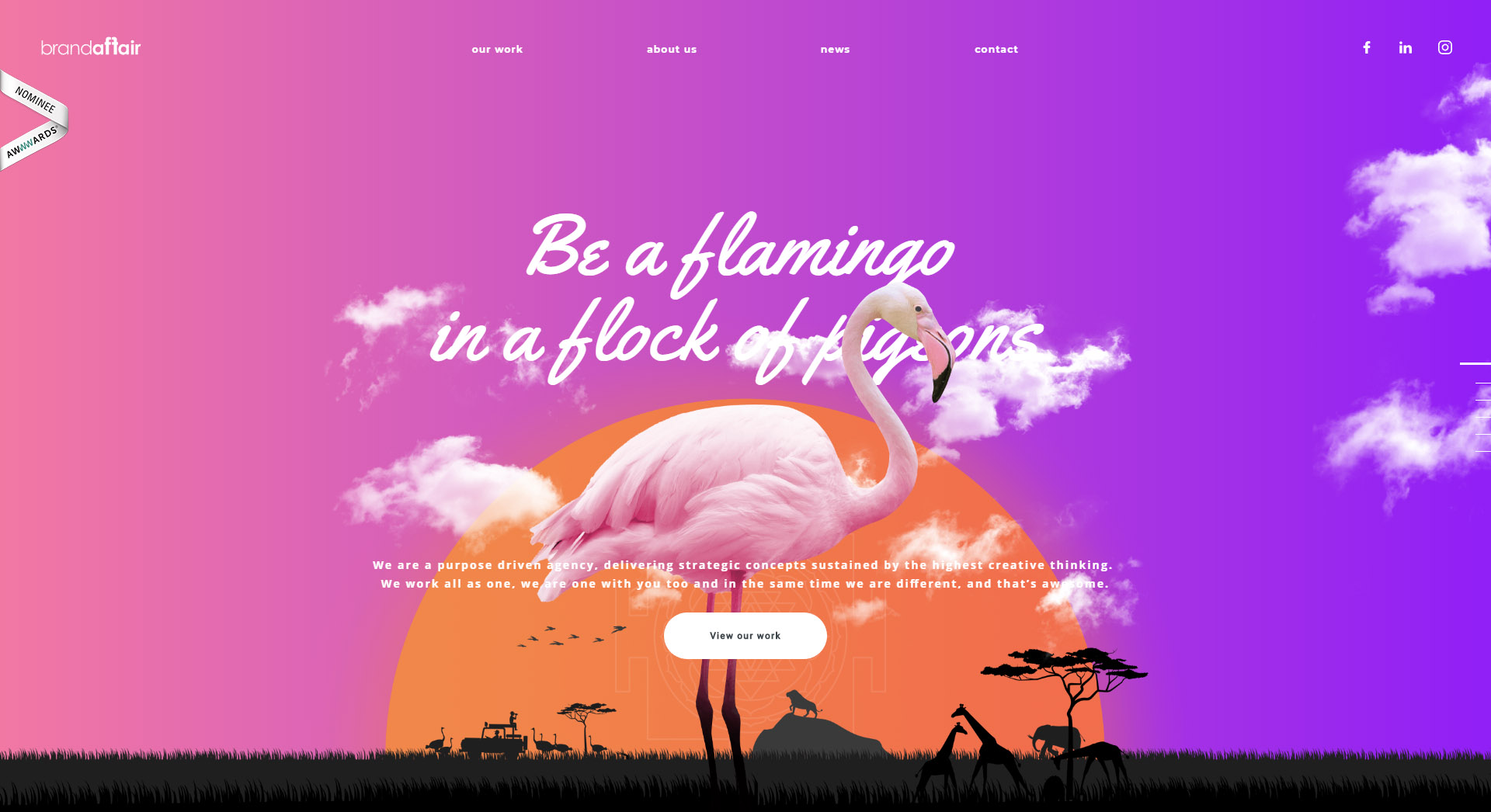
Asymmetrical & Borderless Layouts
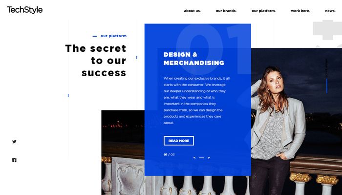
These design trends have been emerging and we think they will really take off in 2019. The conventional grid layout is dead, with technology allowing web designers to reinvent web layouts in new ways. Asymmetrical layouts are popping up everywhere, using lots of diagonal lines, overlapping shapes, and side navigation bars. Busting further out of the grid, many designs are no longer even contained within the “canvas” or traditional borders at all. Whether designs run off the page intentionally, or use scrolling to extend the canvas, you can literally think outside the box this year!
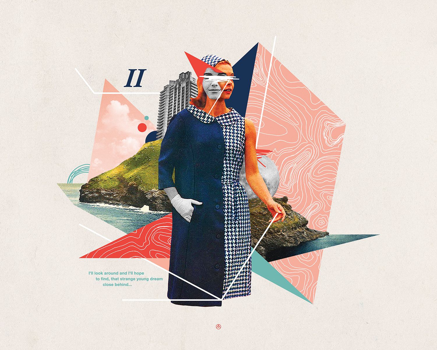
Surreal Collage
Digital compositions that mimic old school magazine collages of the past are a hot option for imagery in 2019. As an alternative to photography or illustration, many artists are experimenting with photo collage to create surreal imagery that can communicate in ways that photos or drawings cannot. Plus, it gives a playful feel to your visuals that make them appealing and have a lot of movement. Collages can combine photo cutouts with flat shapes, silhouettes with textures and portraits with doodles- the possibilities are endless.
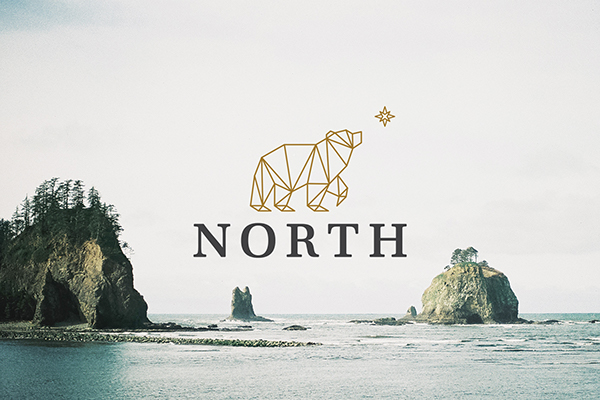
Geometric Lines
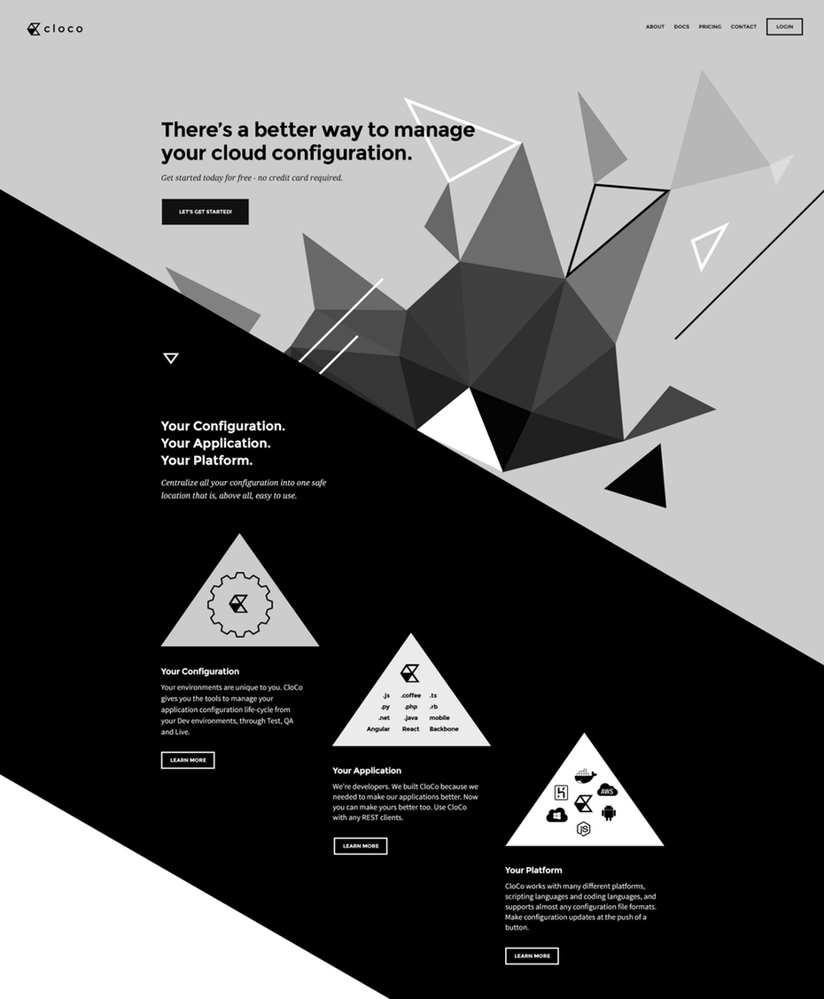
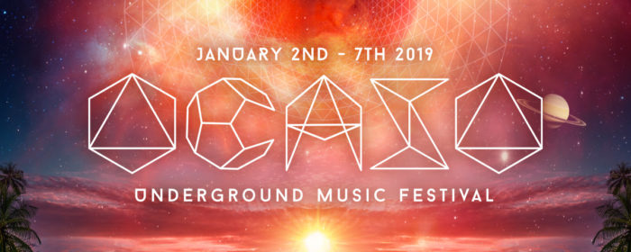
Going strong through 2019 is clean geometric line work and shapes, especially in logo design. Inspired by both mathematics, and the spiritual world of sacred geometry and mandalas, geometric designs are iterated in endless ways by designers. Using basic geometry as a base provides both strength and simplicity to designs. Look for geometric shapes to be used with other trends like gradients, metallics and bright colors for the ultimate visual punch.
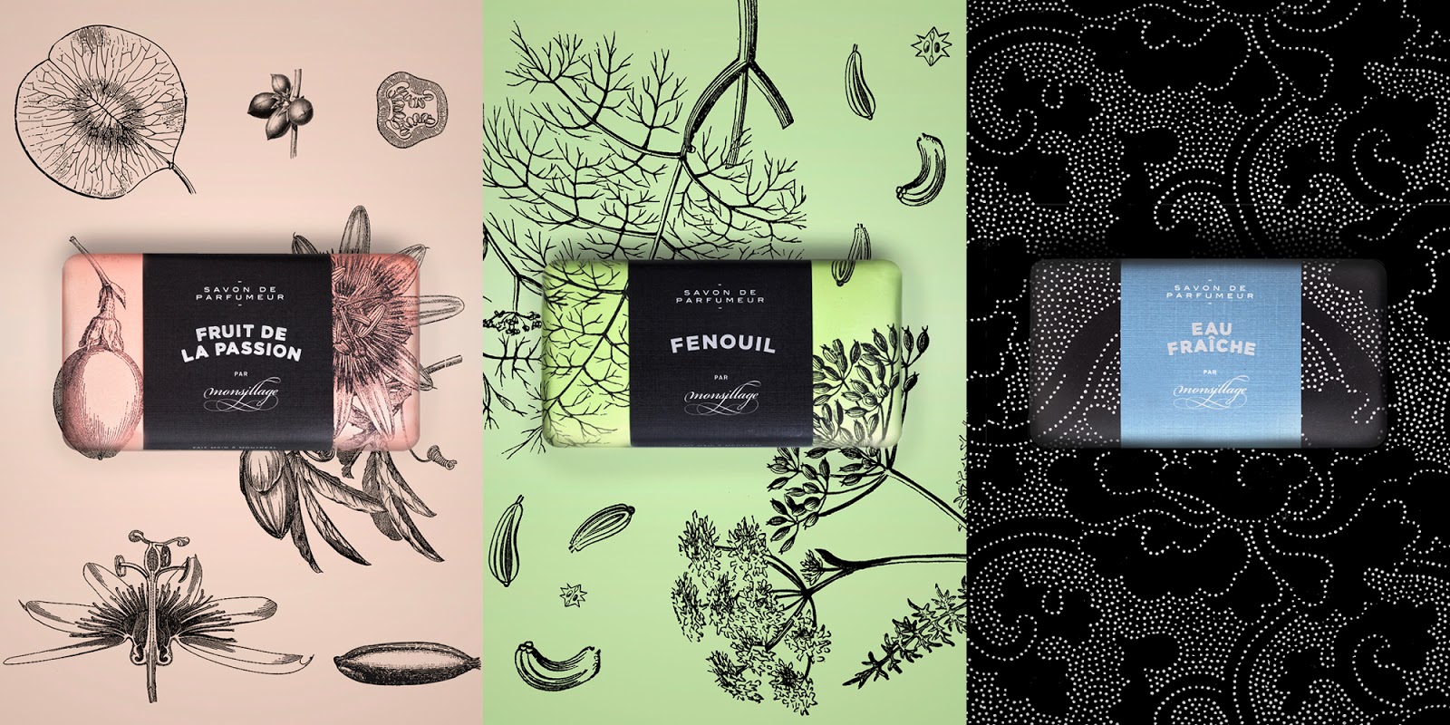
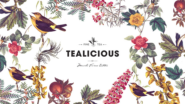
Vintage Illustration
Inspired by the light touch and intricate detail of botanical and anatomical drawings, many brands are using this style for their logos and packaging. Natural, organic, or eco-friendly companies love this illustration style. Logos with this style can combine vintage illustration with a modern font for a fresh yet classic brand identity, often with a muted natural color palette.
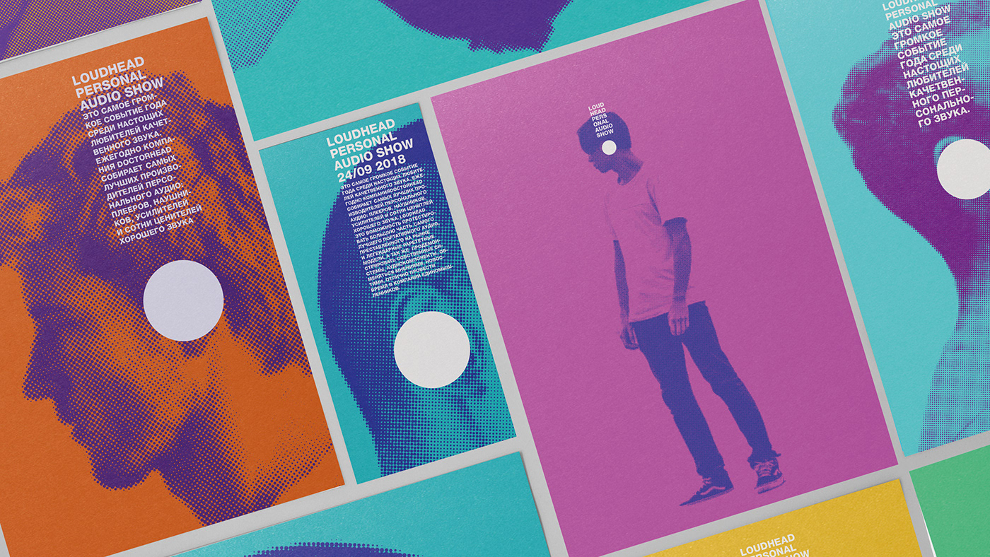
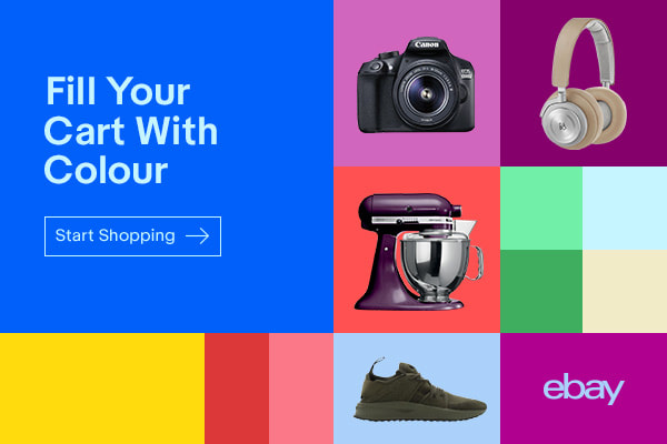
Bright, Bold Colors
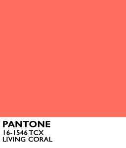
Saturated hues are in and being used liberally. Pantone’s color of the year is “Living Coral”, a vibrant, happy color inspired by nature but bold enough to stand out in our modern digital world. Other colors Pantone included in their trend forecasts follow the same recipe: saturated, bold naturals. “Turmeric”, “Pepper Stem”, “Mango Mojito”, and “Terrarium Moss” are a few examples. You can see these colors across the board, from technology to fashion brands. These colors are often used in chunky blocking or duotone images.
